Gnuplot (technically gnuplot) is a command-driven interactive function plotting program. Put in simpler terms: it is a very powerful graph plotting tool that you can use by giving it a set of instructions or commands, rather than using a GUI or window.
This tutorial goes into how to create a line graph from a csv using gnuplot. Why gnuplot? Find out after the jump.
Many people use applications like Microsoft Excel, LibreOffice Calc or Matlab to generate their graphs. These are great tools for dealing with graphs, but I recently came across a situation that involved a lot more data points than I’d ever handled before1. 539983 * 6 for a days worth of information to be exact. These programs ran really slowly when dealing with this amount of data. At some point in the future, I will have to deal with a months worth of data. Having to go through each day and format these graphs sounded like a nightmare, so I decided to search for another solution.
So I came across gnuplot. I’ve seen a couple of programs use this to generate their charts, but trying to find out how to use it well wasn’t easy. Instead of spending hours searching the man pages, I spent hours searching the internet instead. After spending that time researching, I was annoyed to find out that all I needed was 4 lines.
A slight bit of background: my information is stored in a CSV file (Comma Separated Values) file. This meant that for each row, there was a comma between every value e.g.
1
2
1,2,3,4,
5,6,7,8,
From what I could see online, gnuplot as a standard uses data files that have Space Separated Values e.g.
1
2
1 2 3 4
5 6 7 8
There are a couple of different ways to deal with gnuplot. There are various GUIs out there that you can use, but I prefer to know exactly what’s going on under the hood.
So I chose to pass the commands directly to gnuplot. There are two ways to do this: either open gnuplot and type in the commands by hand line-by-line, or write a scripting file with every command and open it using gnuplot. I suggest you use the second of these two, unless you really know what you are doing.
Gnuplot Line Graph Tutorial
From the command line/terminal, all you need to do once you’ve written your file is:
1
gnuplot scriptFilename
Simple right? But I’m getting a little too far ahead of myself. Here is the contents of the scripting file:
1
2
3
4
5
6
7
8
set datafile separator ","
set autoscale fix
set key outside right center

set title "Title"
plot 'filename.csv' using 4 title "LineTitle" with lines

pause -1
So, that’s the end of the tutorial! Nothing more to say.
Did you really believe that? This is where most tutorials I found usually end; they say “this is how you do it,” and never explain why. I hate those people…
Let’s go through this line-by-line:
1
set datafile separator ","
This first one should be pretty simple to understand. The standard separator that gnuplot uses (as mentioned before) is a space. This command ‘sets’ the separator for data files read into gnuplot after this point to a comma.
1
set autoscale fix
This line does a lot of autoscale magicary that one might come to expect of a graphing program. To be honest, I’m not 100% sure what this actually does (serves me right for starting an article, and not coming back to finish it until 7 months later), but I think I have a good idea. I’ll check up on it at some point.
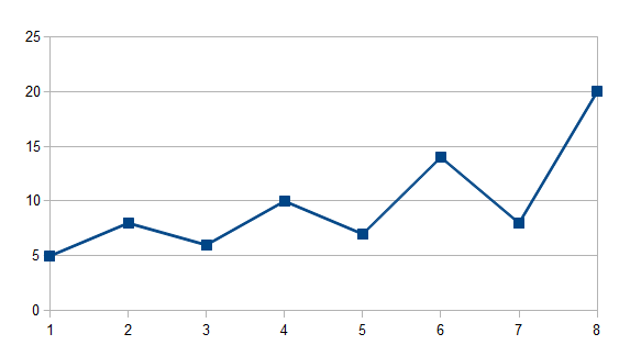
Imagine a line graph like… this one:
 Scale Fix Example 1 (No fix)
Hopefully, you can see that the first and last points are below 20 and above 5 (19 and 6). Let’s assume that the minimum value you can have is 6, and the top is 19. This graphing software has chosen a minimum of 0 and maximum of 25, which doesn’t make much sense in this case as it’s just not possible to reach those values (in reality, I believe gnuplot would choose 5 and 20 if you turn on autoscale).
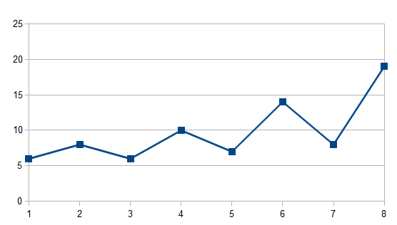
If you set the auto-scale option to fix, it will not extend the graph beyond the minimum and maximum. Using the same data, this graph would look something like…
 Scale Fix Example 2 (fix)
So essentially, the fix option makes sure that the graph fits the axis to the data the graph is showing.
1
set key outside right center
This line sets the key of the graph to be outside the boundary of the graph, on the right hand side, centred on the vertical axis. Without this line, the key is placed inside the graphing area, hiding all that precious information you want people to see.
Wait. You don’t want people to see all your graph? Well, most people don’t seem to mind it as it is the default behaviour. Fine, remove it. See if I care.
1
set title "Title"
This will set the title of the graph to ‘Title’. I suggest you change the name of the graph to something other than ‘Title’ if you do decide to use this code.
1
plot 'filename.csv' using 4 title "LineTitle" with lines
Now this is the big line.
Plot tells gnuplot that you want to plot a graph. The next part is the actual data you want to plot; this can be a file or data stored in a variable from elsewhere in the script.
The next thing is ‘using 4’. This specifies to use the 4th column of the data we just mentioned.
The ‘title “LineTitle’ part specifies what to call this particular line in the key. Again, I also suggest you change LineTitle to something more… meaningful.
And finally, ‘with lines’ tells gnuplot that you want to make a line graph. There are plenty of other ways to display other than lines e.g. points. That’s tutorial has gone on long enough though.
Oh wait, there was one more line wasn’t there.
1
pause -1
I added this in because I found that gnuplot liked to close the graph immediately after it was displayed to the screen; this only happens when using this as a script, as gnuplot will close immediately after finishing one. The line here just tells gnuplot to pause for infinity, until I can be bothered to close the graph myself.
The End
If you have any questions or want to comment on anything to do with this tutorial: please leave a comment at the bottom of this post and I will respond to the best of my ability. Thank you for reading this tutorial and I hope to see you again soon!
Technically, this isn’t true. I once had to handle all the temperature details on a day to day basis for as far back as the MetOffice was allowing me to get my hands on. While this isn’t as much, the preprocessing I had to do for the project made the amount extremely large. Hurray for coursework! ↩